Landcrafters
Landcrafters specializes in landscaping for large-scale buildings and urban spaces. This branding project combines an upbeat and stylish visual identity with a hand-crafted logotype inspired by topographic map lines. The design reflects the company's dedication to precision and natural harmony, resonating with their posh clientele and expertise in sophisticated outdoor design.

Problem
Landscaping companies often rely on overused visuals in their branding, such as leaves, flowers, or depictions of water. While these elements represent nature, they fail to stand out in an oversaturated market. Companies specializing in landscaping for buildings and private spaces also struggle to balance professionalism with a connection to nature, often leading to generic or uninspired designs.
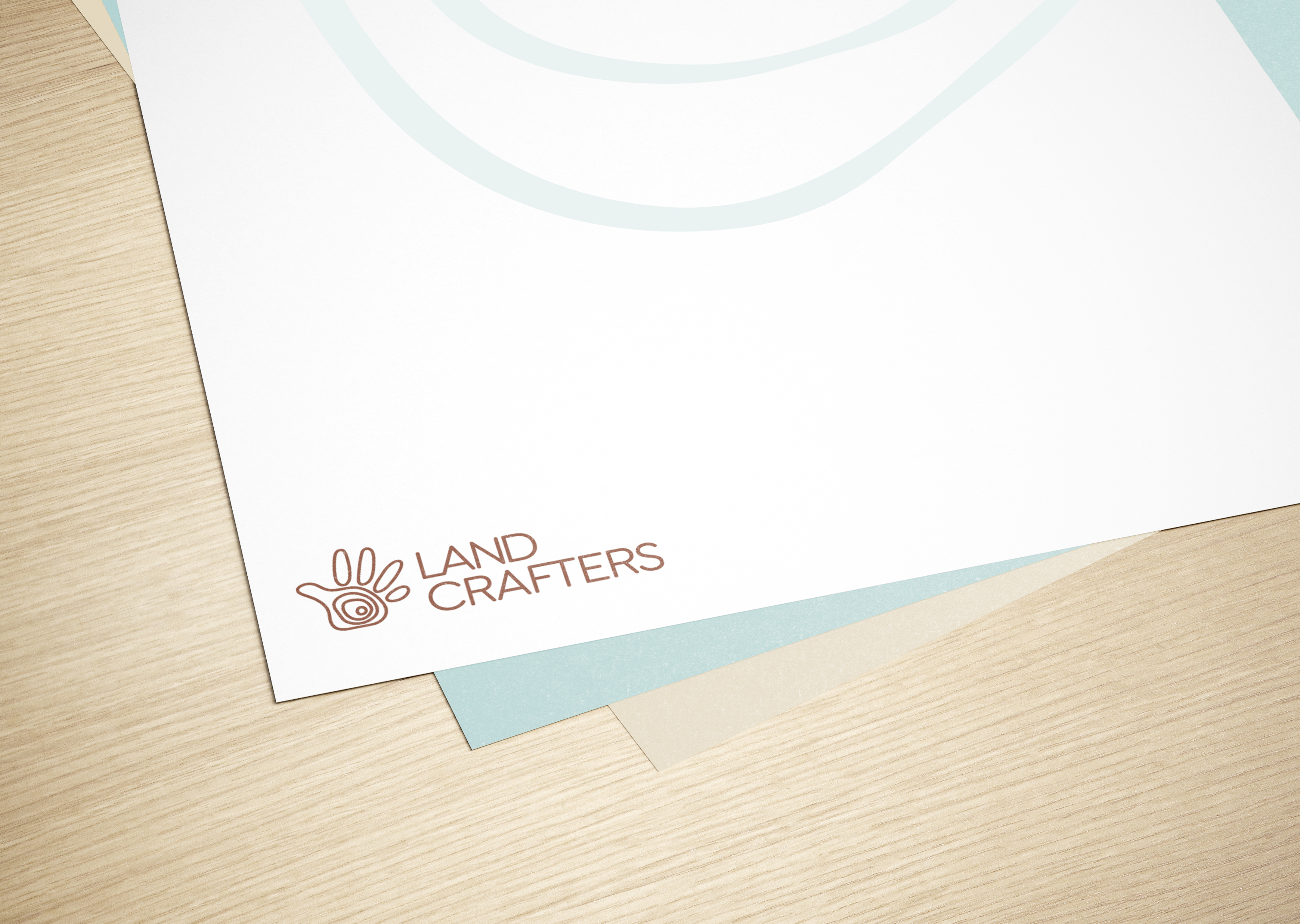
The logotype's aim is to convey the idea of leaving a mark on the land.
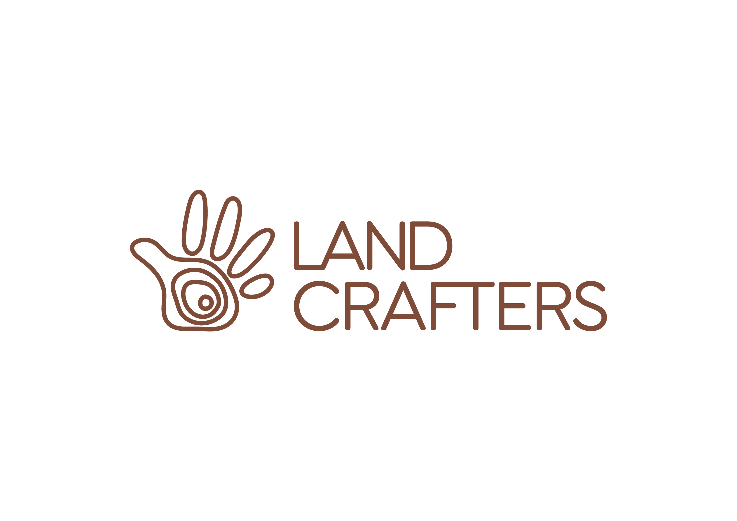
The hand-crafted design features topographic map lines, symbolizing the seamless blend of nature and human craftsmanship.
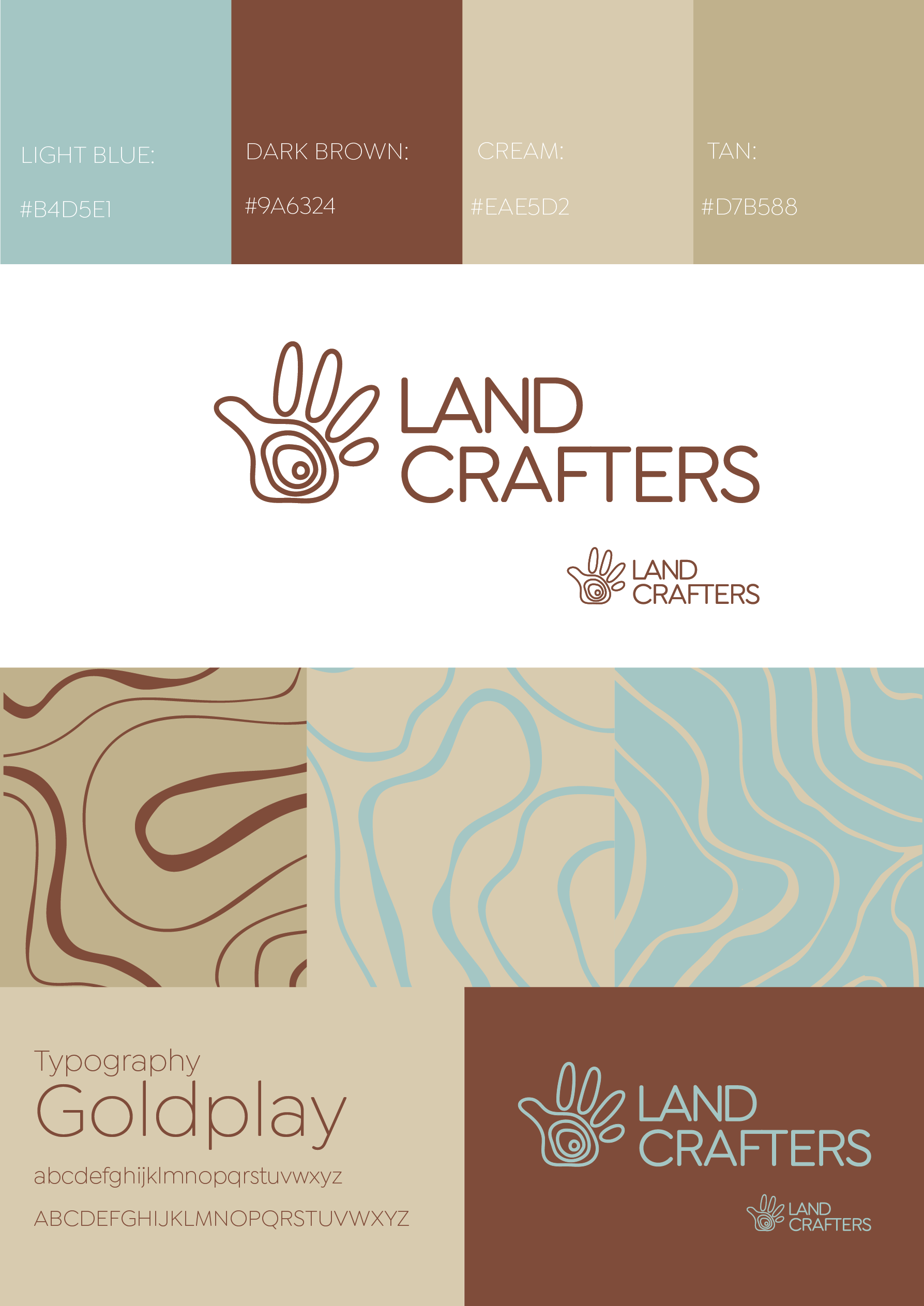
The Landcrafters color palette and logo variations showcasing adaptability across different tones while maintaining its map-inspired identity.

Approach
To create a unique and memorable identity for Landcrafters, I began by researching common branding trends in the landscaping industry. It was clear that an innovative concept was needed—one that highlighted the company’s expertise in blending natural elements with architectural spaces, while also reflecting a handcrafted, personalized approach. I chose to explore the use of topological map lines as the central visual element. These lines symbolize both the organic flow of nature and the precision required for professional landscaping. A hand-drawn style was incorporated to emphasize a meticulous, human touch, reinforcing the company's commitment to careful craftsmanship. The design process included experimenting with earthy tones, particularly shades of brown, to maintain an organic yet professional aesthetic. The visual identity was expanded by using zoomed-in topological patterns as versatile design elements for backgrounds, marketing materials, and decorative accents.
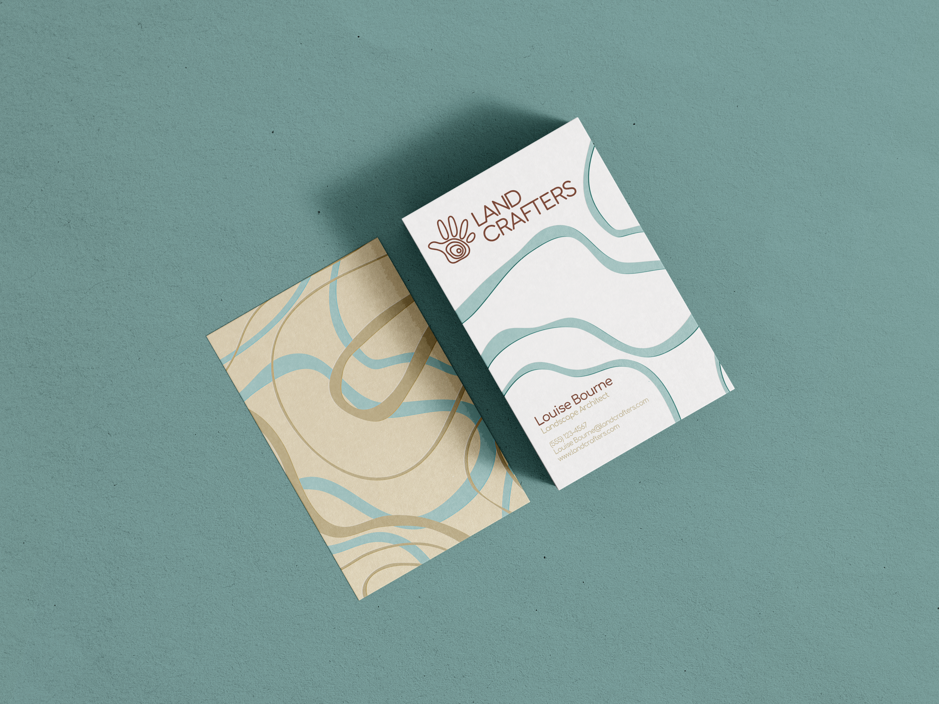
Upbeat and stylish business cards highlighting the handcrafted logotype and modern design elements.
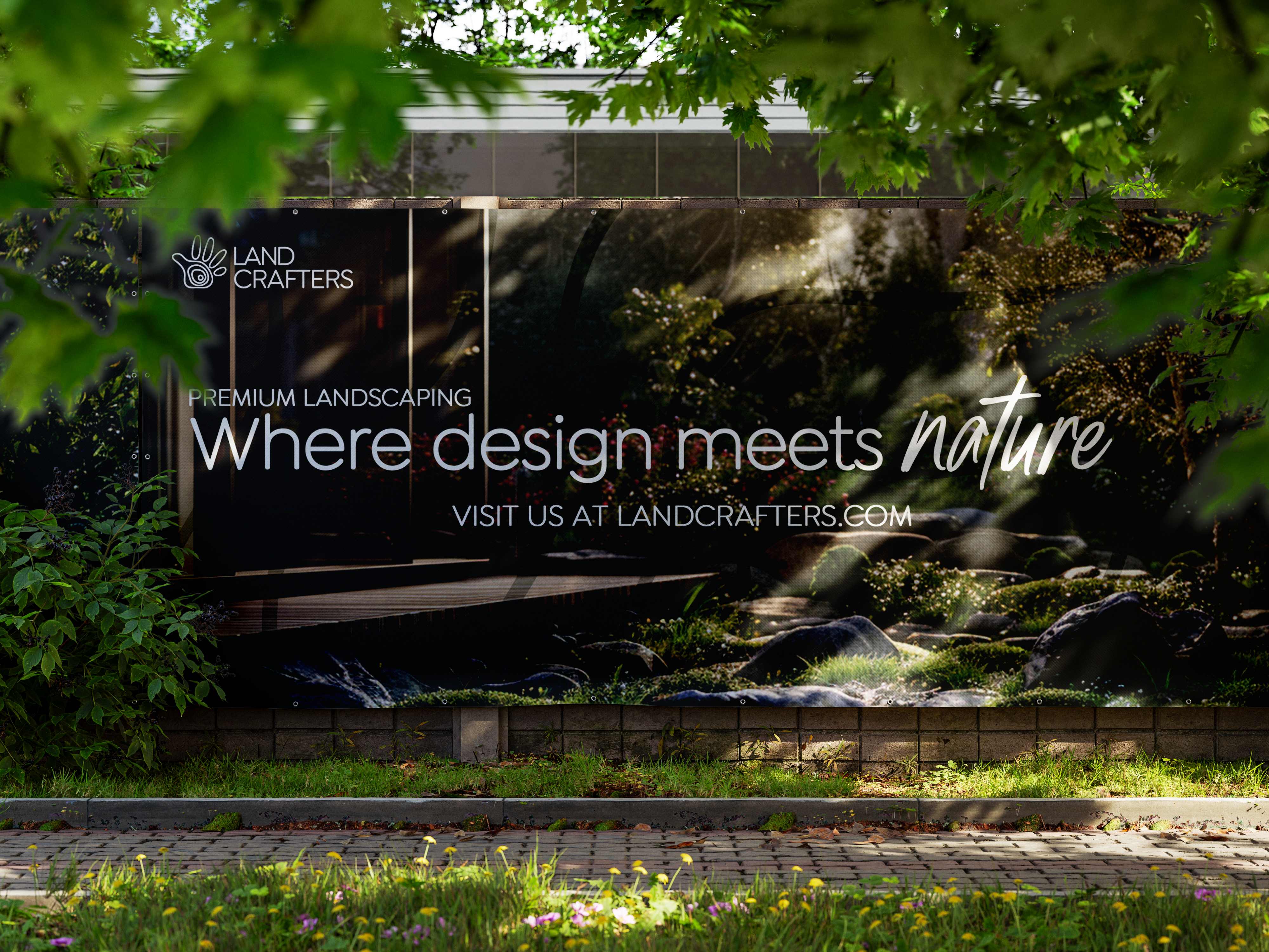
The concept for the street ad was 'blending' with the natural surroundings, showcasing the idea of creating natural spaces.

Solution
The final branding for Landcrafters centers around a hand-drawn logo featuring topological map lines, subtly shaped into a hand. This symbolizes the brand’s hands-on, tailored approach to landscaping. The visual identity extends into patterns inspired by these lines, creating a cohesive, modern, and nature-inspired design system. This unique approach ensures that Landcrafters stands out in the landscaping industry while maintaining a professional and organic connection with nature. The branding successfully communicates the company's dedication to creating harmonious, carefully crafted environments for both buildings and private spaces.