Logofolio
I’ve put together a collection of logotypes I made to practice different styles and ideas, plus some of them are from my clients! I came up with businesses, some pretty common, others a bit more out there to push myself to be as creative as possible while trying out new approaches.
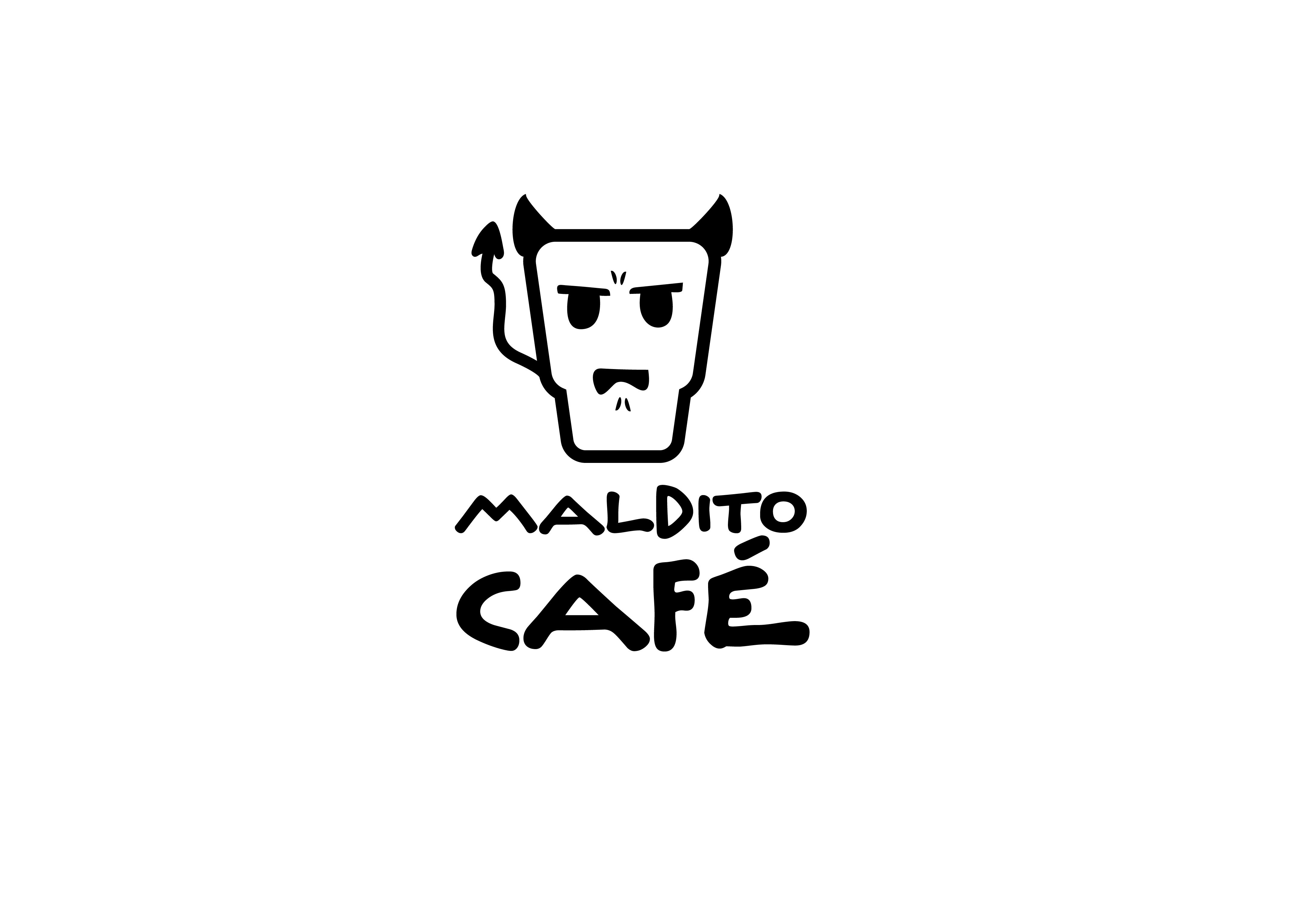
A playful logotype for a coffee shop that leans into the love-hate relationship many have with coffee. It’s got a fun, cartoony vibe to make it stand out and stick in your memory.
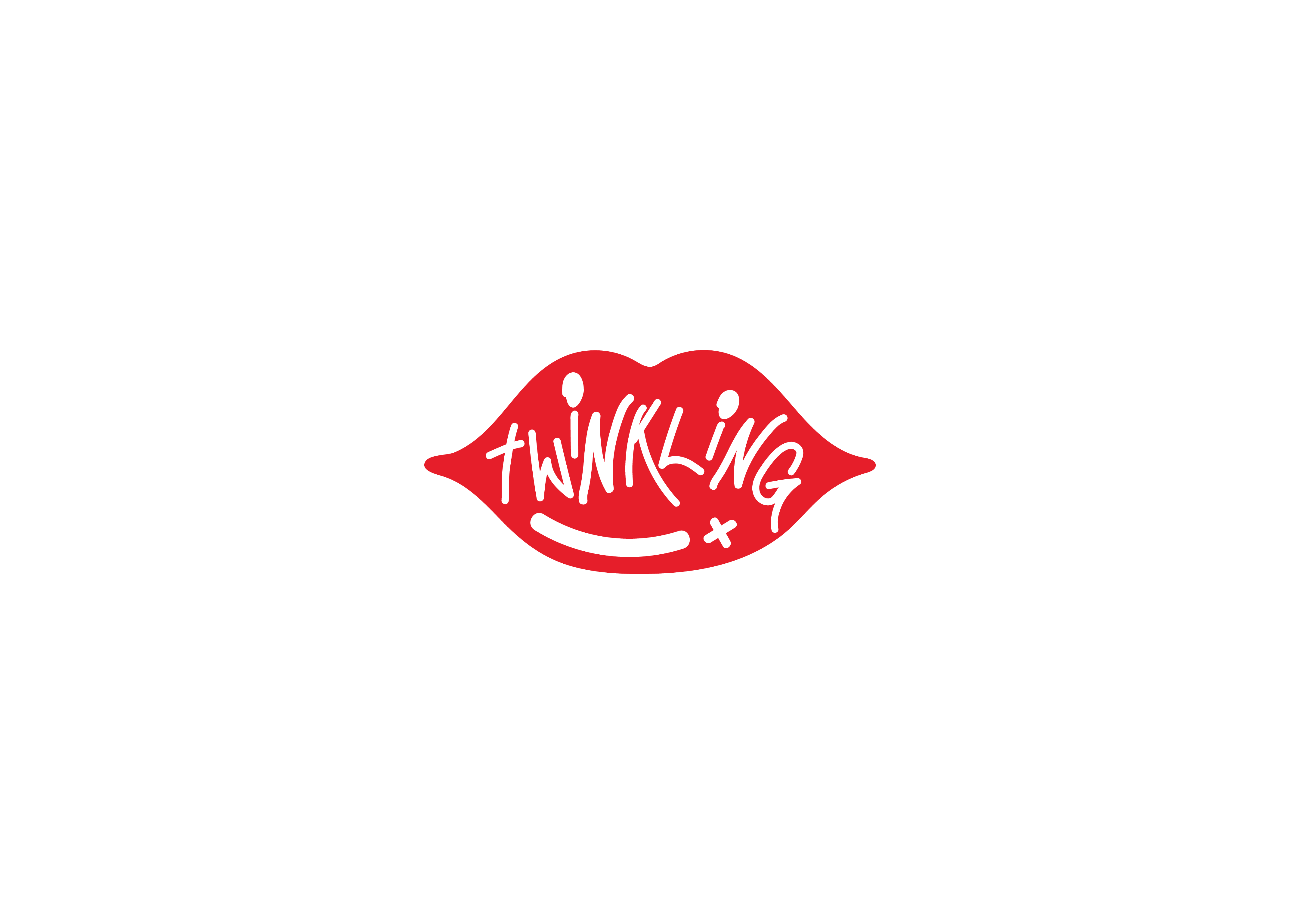
This one’s for a makeup brand—a lip-shaped logo with 'Twinkling' written in white inside. The design is bright, youthful, and playful, made to grab attention.
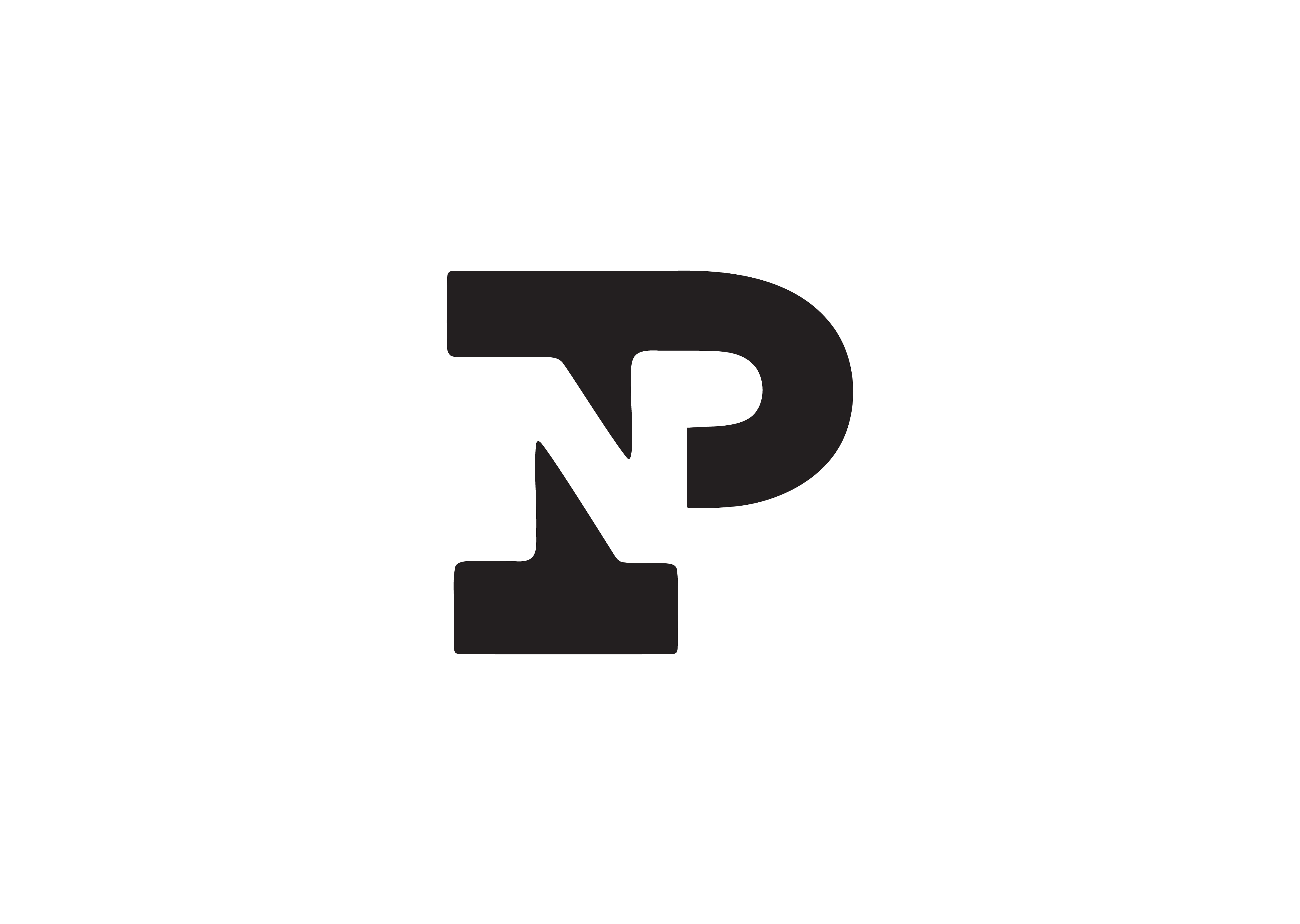
A monogram for a personal brand that’s no-nonsense and professional. Straightforward and sharp—this person means business.
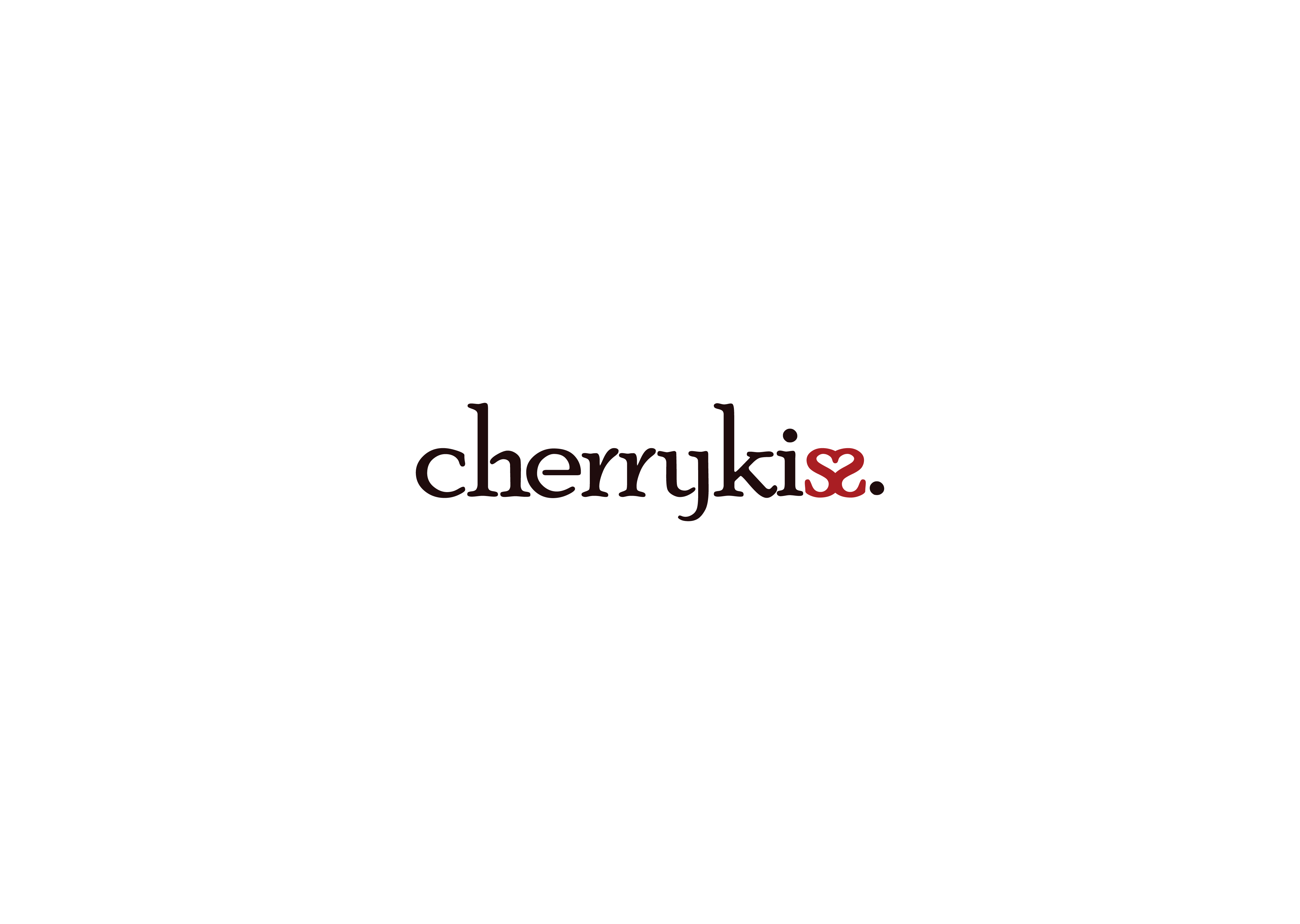
How do you convey sensual themes with elegance? This brand pulls it off with color and clever typography. The 'Cherrykiss' logo flips the last 'S' around, forming a heart at the top of the letters. It’s subtle but makes a statement.
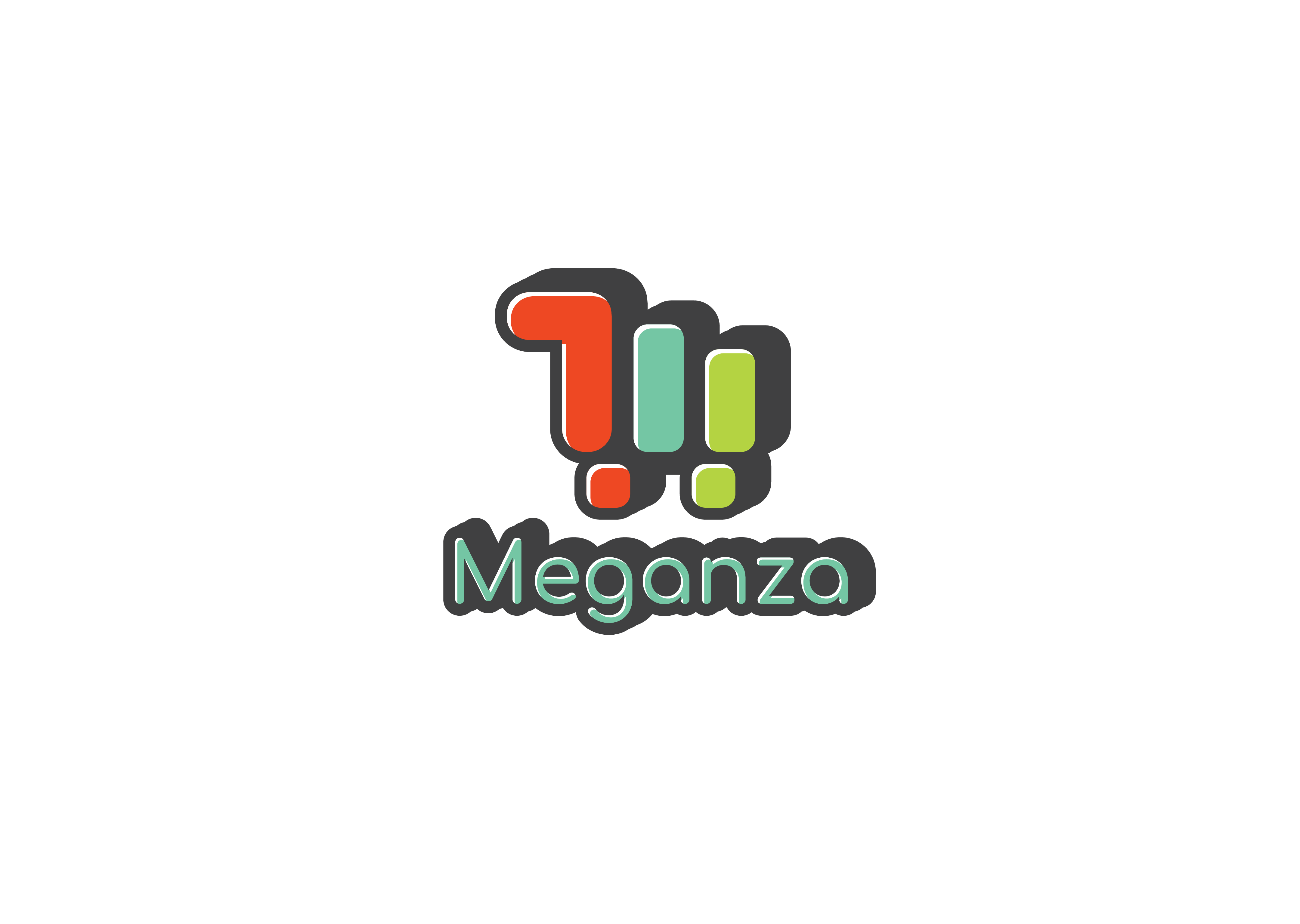
A bold, clean design for a wholesale grocery store. The simplicity and strong lettering communicate the 'max' or 'big' concept perfectly.
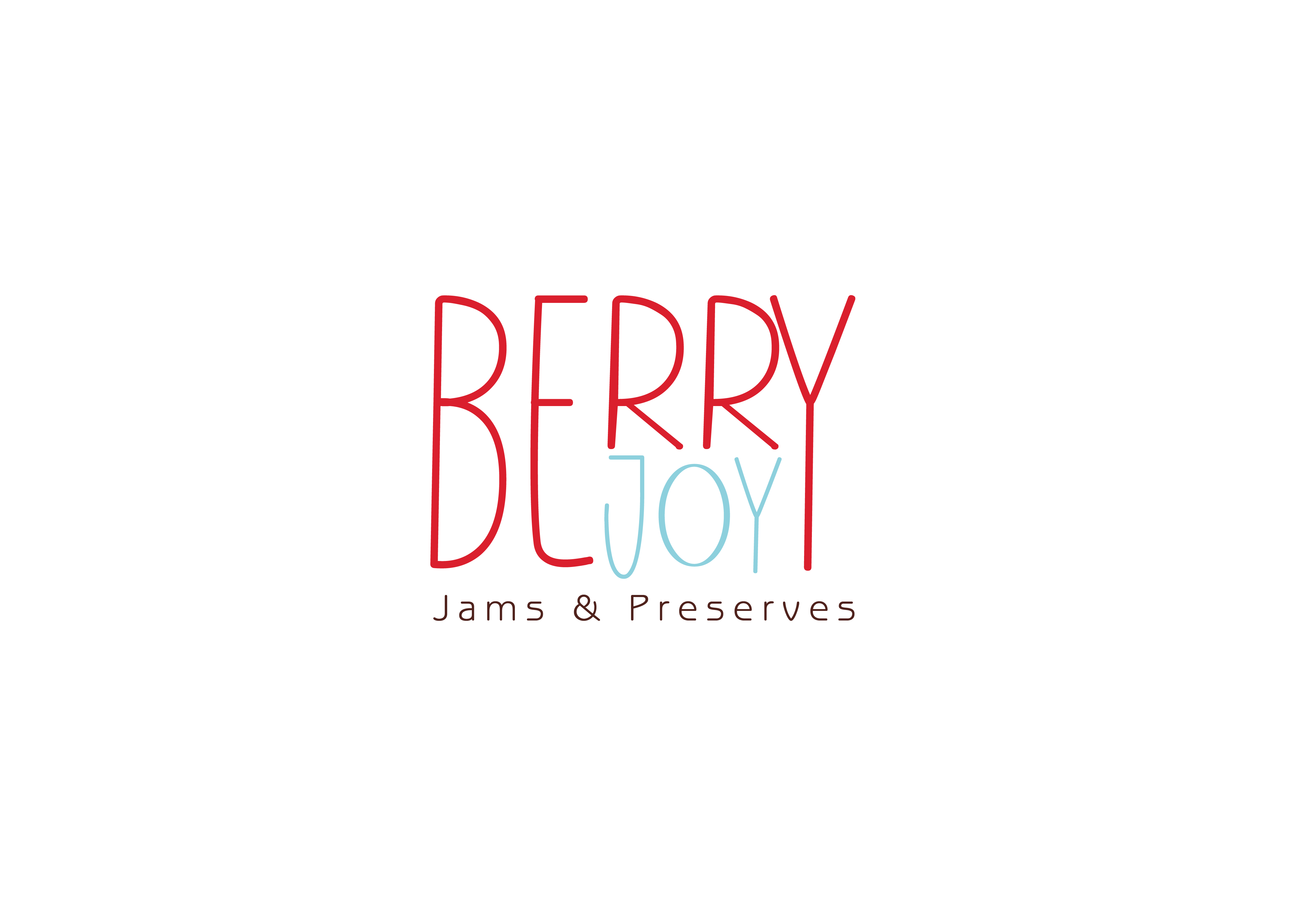
This cheerful jam brand combines tradition with a playful, childlike feel. The hand-drawn font adds a personal, homemade touch.
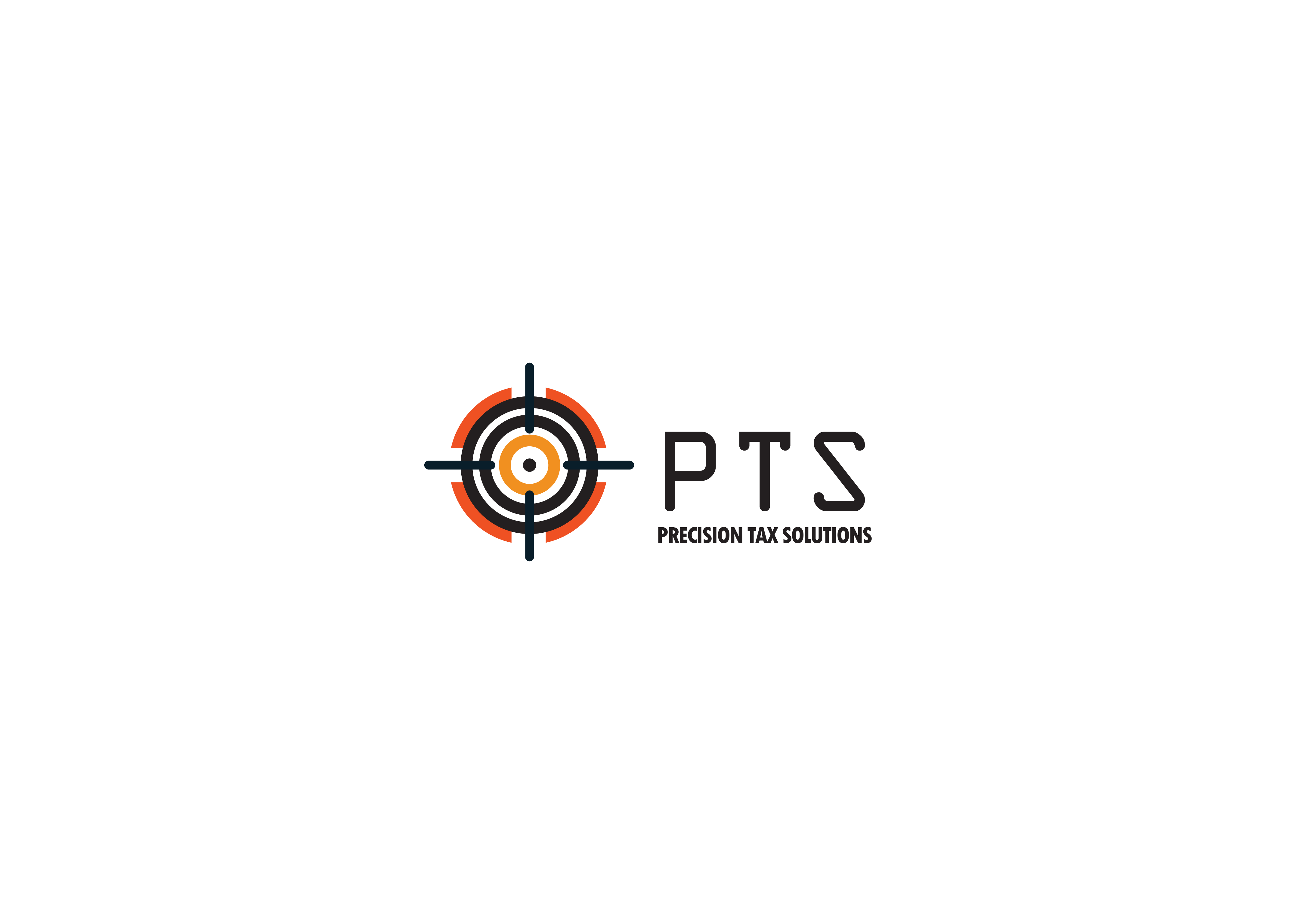
A straightforward and serious logotype for a tax solutions business—clear and professional.
A soft, delicate logo for a skincare solutions brand. The design is clean, gentle, and reflective of the product’s purpose.
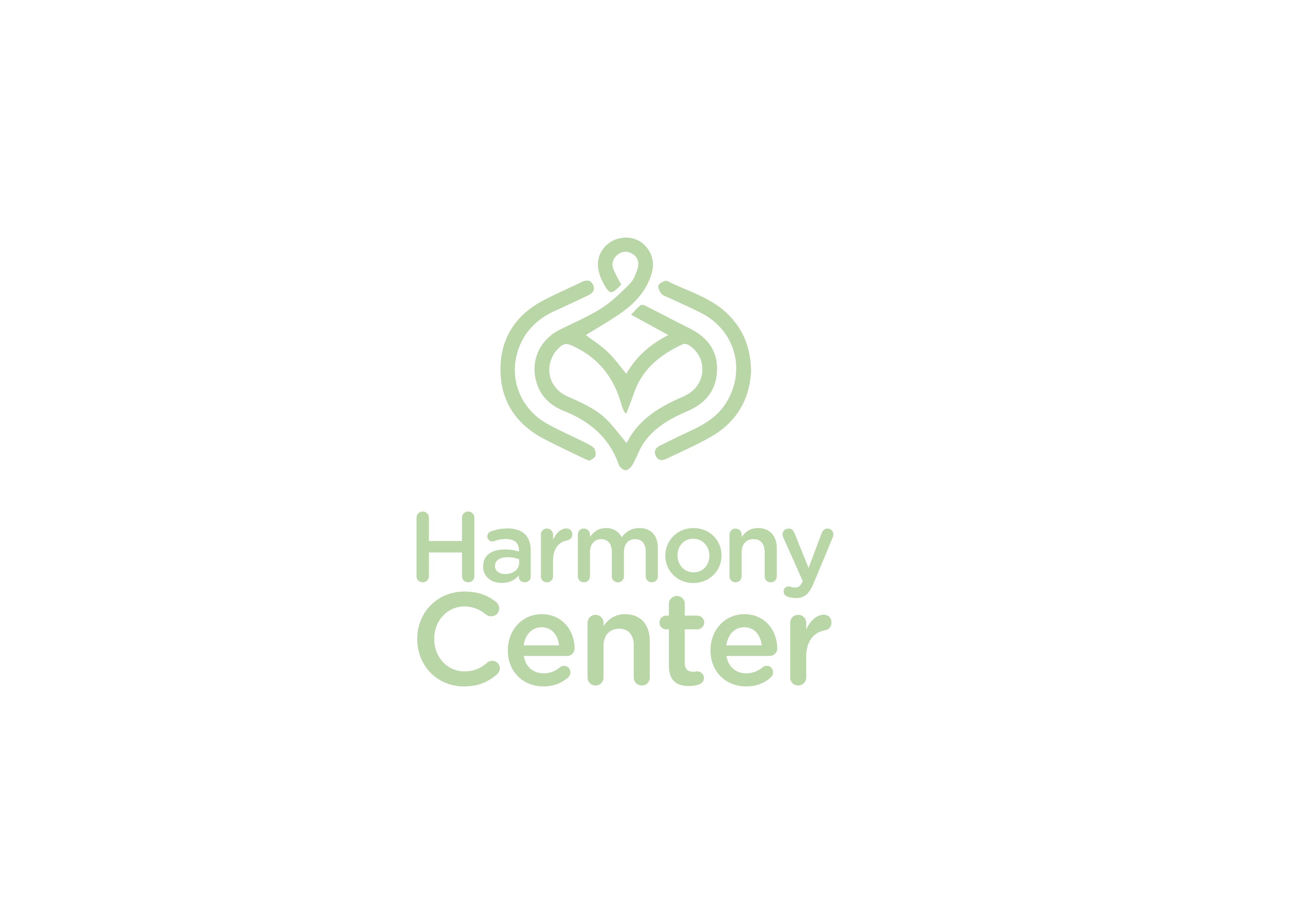
The Harmony Center logotype uses a soft light green tone to evoke serenity and balance. Its simple, fluid design conveys harmony while remaining memorable