Preventia Branding & Digital Experience
Preventia is a branding and digital design project focused on creating a clear, accessible, and modern visual identity for an allergy-awareness platform. The project expands across mobile UI, responsive web design, social media content, and informational layouts designed to communicate health-related information in a calm and approachable way.
The visual direction combines bright colors, clean typography, and intuitive interface design to create an experience that feels supportive, organized, and easy to navigate across multiple digital platforms.

Problem
Health-related platforms often struggle to balance clarity, accessibility, and visual warmth. Many medical or informational apps feel overly technical or difficult to navigate, especially when presenting large amounts of data or alerts. The challenge for Preventia was creating a cohesive visual system capable of presenting important information in a way that still felt approachable, modern, and user-friendly.
Preventia combines interface design and branding into a cohesive digital experience focused on accessibility, organization, and clarity.
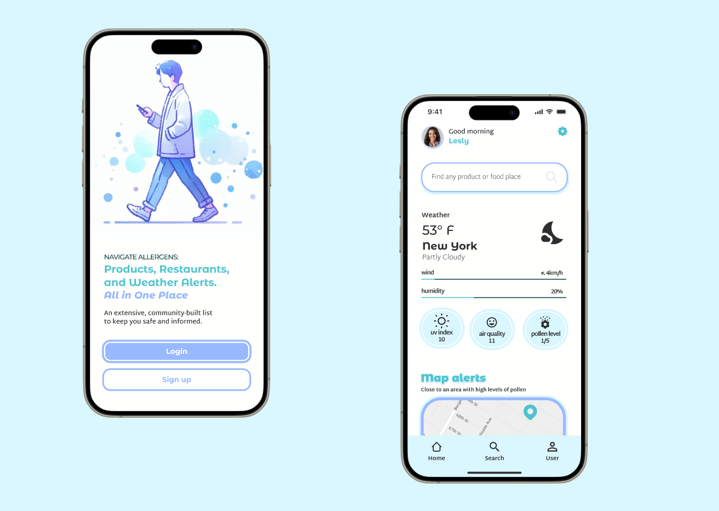
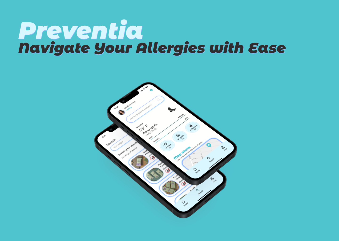
The mobile layouts prioritize simple navigation, readable information hierarchy, and a clean visual structure that feels intuitive and easy to explore.

Approach
The project began with the creation of a flexible visual identity system that could adapt naturally across mobile, web, and social media applications. The focus was placed on maintaining consistency between platforms while ensuring that information-heavy layouts remained visually clean and accessible. Typography, color choices, and iconography were carefully selected to support readability and reinforce the project’s calm and supportive tone.
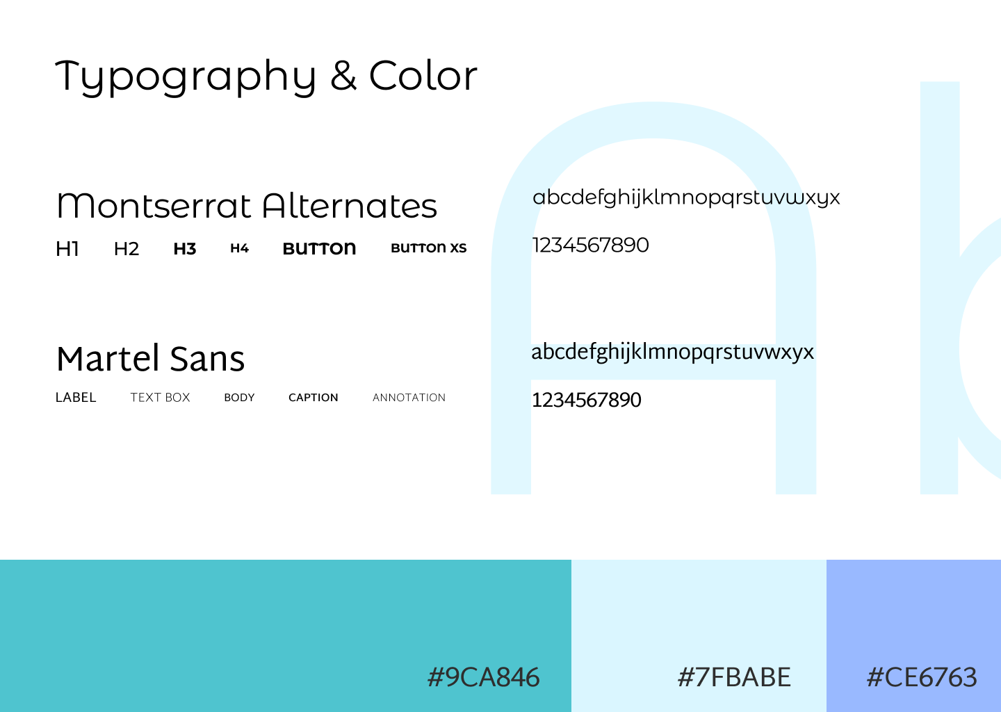
The visual identity uses clean typography and bright accent colors to create an accessible and modern aesthetic across the entire digital system.
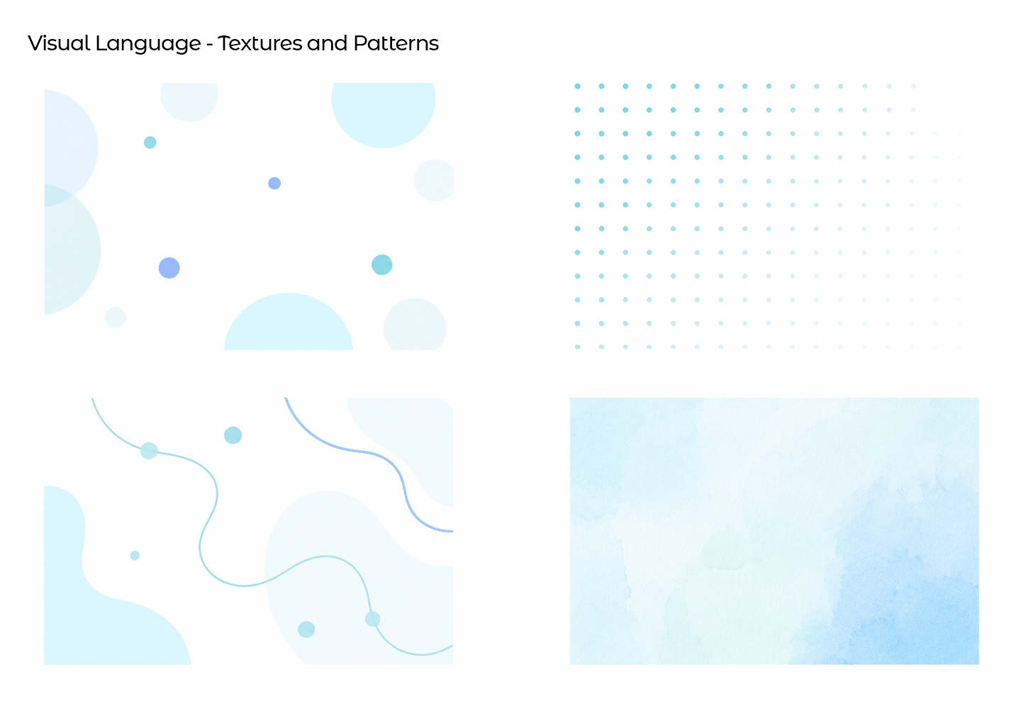
A collection of custom patterns, decorative elements, and supporting textures developed to reinforce the Preventia visual identity.
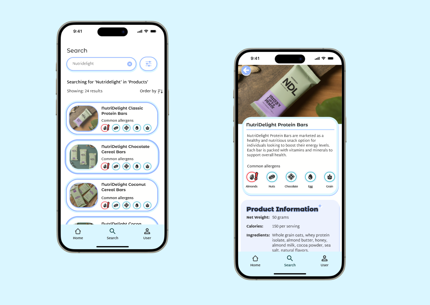
Interface elements such as icons, alerts, and categorized information blocks were designed to make complex information easier to scan and understand.
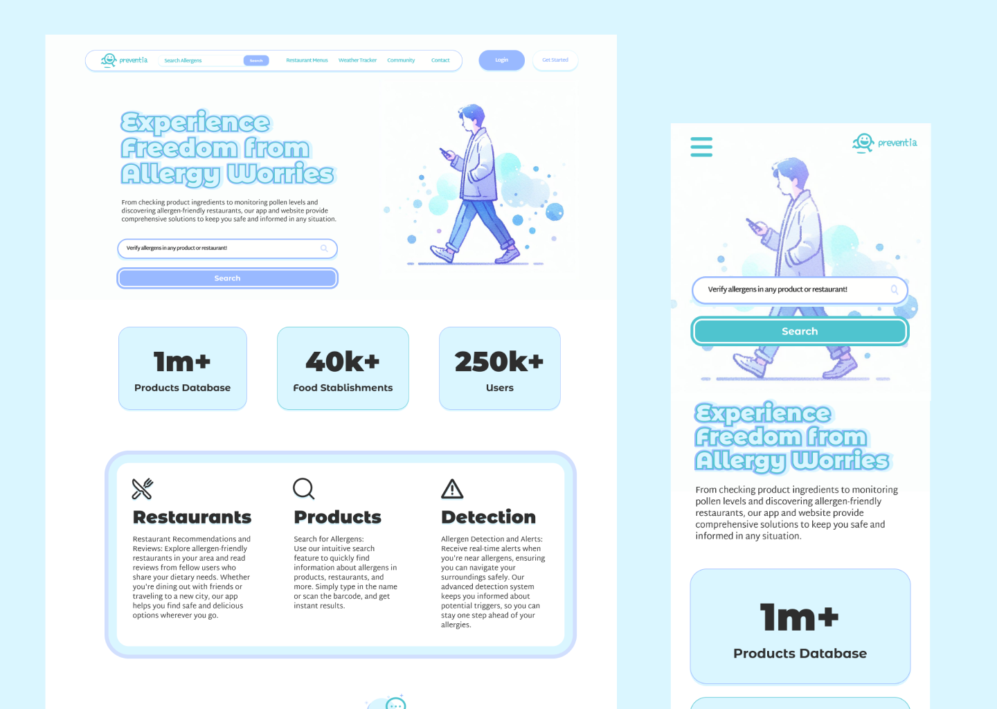
The project also expands into responsive web layouts, adapting the Preventia identity into a broader digital platform while maintaining visual consistency between desktop and mobile experiences.
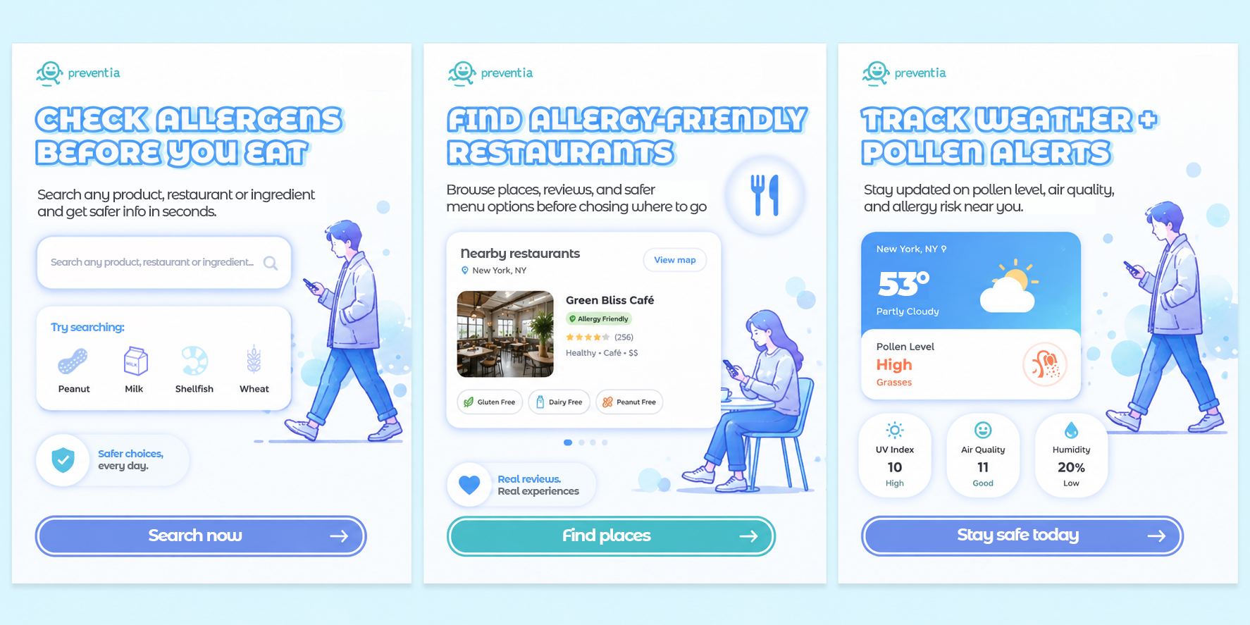
Social media assets were developed to extend the identity into promotional and educational content while maintaining the same approachable and organized visual language.
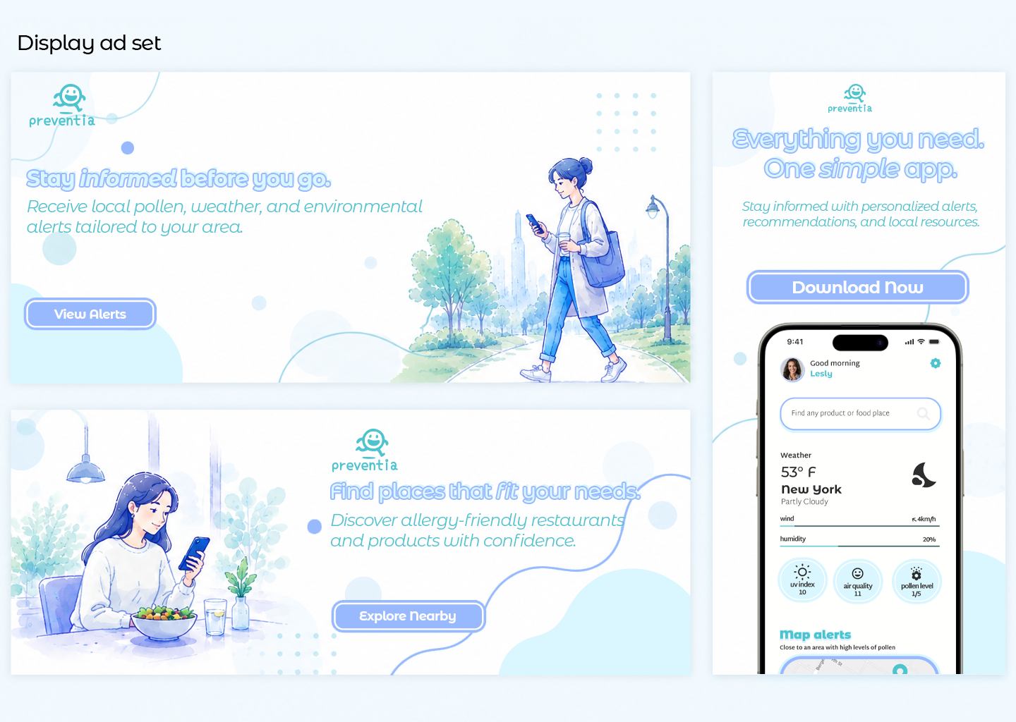
A set of digital display advertisements created to extend the Preventia brand across marketing channels.

Solution
The final result is a cohesive branding and interface system that successfully adapts across app design, responsive web layouts, and digital marketing materials. By combining clean visual communication with accessible interface design, Preventia delivers a digital experience that feels modern, informative, and approachable across every platform.